I first saw the work of Kenneth Brown in the pages of House Beautiful and from the first room I saw, I was hooked. His work is very distinctive with the use of bold colors and patterns but using them in a more traditional way- exactly the look I love. He can be seen on HGTV's reDesign and also has a new show Over Designed on TLC.

There are many loft apartments in Boston, and every one I have seen looked so modern and cold to me. His design here is so warm and inviting, I could definitely live in a loft like this. Those zebra chairs are to die for, and the gallery wall is perfect on that wall.


 Again with the zebra print, and I love his use of bright, bold colors here. This would be a perfect guest room for me.
A close up of those amazing chairs....I want them!

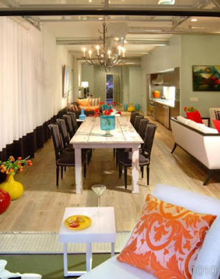
 I think I like this loft more than the first one- its more me and a little brighter. The black and white wallpaper is beautiful just on one wall, and I love how the yellow vases just pop in front of it. I love how he paired the old farmhouse table with those chairs, I love the mix of dark and light. I can't leave out those lights- they are awesome!
 Another view of the same room- love that pillow!
 More zebra- love it! Hmmm, don't those yellow vases look familiar?

 here
here
This bathroom is amazing, I love the two sinks- how many fights about toothpaste in the sink would that save :)
 This rug adds so much interest to this room, and with the green and gold its fabulous.
 This is the perfect mix of old and new to me- I love the very traditional bed, but then have a very modern looking side table and bench covered in black leather. More zebra to give it that extra touch and with my favorite color orange- I love this room!
 Those orange chairs are great, and since they are my favorite color, how can they be wrong?
 Those benches look like the same used in that blue bedroom above, I like how there are paired to add extra seating.
These were just my very favorite designs of his- there are many many more from his shows and website- you can check out more
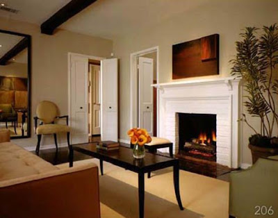
This is a great entryway, and I really love the floors here- the dark color wood is my favorite. I love this fireplace, I wish that's what mine looked like.I really like this desk area, its very masculine to me, but in a way that I could enjoy working there. That brass lamp looks so old world, but paired with the plain drum shade its prefect. Another view of the same apartment.


3 comments:
Oh what I great find. His work is amazing! You know I love zebra so this is a man after my heart. Love it all.
Great post - really enjoyed these interiors.
What a wonderful portfolio. I've loved him ever since hgtv. great pictures!
Post a Comment